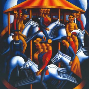
I have disliked, even hated this picture since I was very young. I have never known very much about it or the artist but something visually about it has always caused me to feel uneasy. I have narrowed it down to the shading on the golden, orangey form of the merry-go-round, horses and figures. The repetition of figures and horses has also been very irritating and has made me feel like bursting into a fit because although I physically hate the image it really sticks in the mind because of these devices. Painted by Gertler at the height of the First World War it was actually intended to be disturbing and evoke the horror of war. The juxtaposition between the childlike joy of a fairground and the violent horror and mechanical action of war is something evoked so well in this picture that it has stuck with me for so many years. It’s something I hate to look at but can hardly forget – I tentatively walk round Tate Britain in case it pops up in front of me. I remember it clearly as a child because it broke the spell of the Surrealists Dali, Miro and Magritte who were exhibited in a room close by.
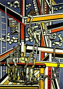
Similarly I have not really liked a lot of the work by Fernand Léger. With The Builders it’s the boldly intrusive form of the scaffold, the flat primary colour, thick black outlines and shading which perturb me. Although these are qualities which I find the most attractive in my favourite artist; Hiroshige, it only feels wrong here. I think the naive, simplified depiction of the figures annoys me because of their genericness. They have a mannequiness about them, a lack of life while performing real life duties or actions such as construction or riding a merry-go-round. Léger painted this among many depictions of everyday life and work once he had joined the Communist party in 1945. It was part of his social consciousness effected by World War 2 and possibly his early training as an architect.
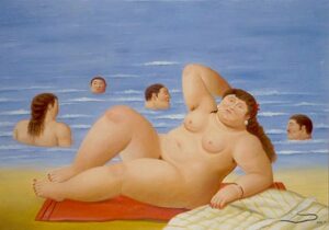
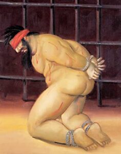
Although I don’t find this such a bad picture – it’s actually ok! I can’t stand the style of Fernando Botero. The trademark round woman with a cartoon-like face exhibits as little life as the figures in The Builders or Merry-Go-Round. I guess again it’s the inanimateness of the figures which I dislike. Although there is a great sense of humour in these people, I can’t stand the round, tree trunk-like volumes of the limbs. The tonal treatment used to describe these limbs as physical forms reminds me of Gertler’s treatment of the Merry-Go-Round and Léger’s construction workers. This basic tonal description is effective but I think it’s the brashness of it which simultaneously sticks in my mind but also too heavily defines forms which I find jarring. I was however very impressed by Botero’s series of paintings depicting the conditions of prisoners in Abu Ghraib. I felt that the exaggerated body style actually worked very well to emphasize the tortures inflicted on the human flesh. They were more powerful because of this style and orientated around a humanistic point of view.


Leave a Reply