The pale, diluted colours of Agnes Martin’s most famous images are elegant and soothing. But these are shown in the very first room of the new Agnes Martin show at Tate Modern. The other ten rooms are a how-she-got-there display and you have to be very keen on Agnes Martin and her work to find the subtle changes and obsessive grid-drawing interesting for the complete length of the large show.

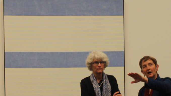
Curators Frances Morris and Tiffany Bell speak about Martin’s work
What we’ve got here is a full-on retrospective, the first one ever for this reclusive Canadian-American painter. But maybe there’s a reason why there hasn’t been a retrospective before, even though she died in 2004. Much of her work is very similar, and seeing painting after painting with pencil lines, grids and diluted painted bands becomes visually tiring. There is a room showing her brief foray into making objects, but even there those grids are still apparent. It is the sort of work that benefits from judicious editing. No doubt much has been left out – there is no work from before 1954 – but a smaller less extensive show would have given a more positive impression.
Clearly Agnes M fell in love with the grid. It pops up everywhere throughout her work, whether screen printed onto paper or simply penciled onto canvas. Her choice of ultra-dilute paints is welcome, the attractive, unusual colours taking some attention from the obsessively rigorous right angles, horizontals and verticals of the works. It’s a palette Morandi would have approved of. No pots creep into Martin’s work – there are a few geometric forms, but basically Martin was an artist who headed to the studio, took out her ruler and started to draw lines. She continued this utterly repetitive technique over decades, pausing only when suffering from schizophrenia.

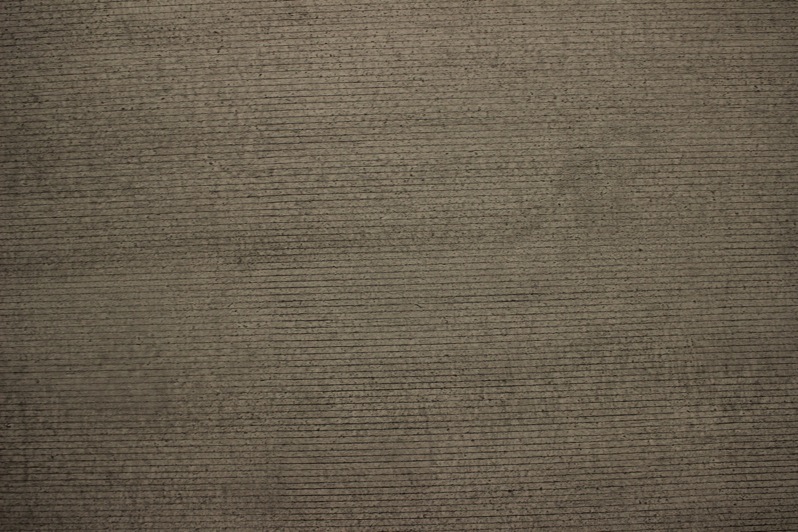
Close up of Untitled #12
Untitled #12 in room 8 is the most interesting image in the show. It has the feeling of an Assyrian panel or a medieval document in a long-forgotten language, carved with illegible characters and hieroglyphs. Blurred and appearing water-damaged the horizontal pencil lines dissipate in the concrete textured ground. Like ruined homework it suggests lost knowledge.

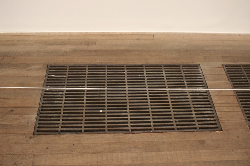
Behind the barrier: Agnes Martin grid sculpture? or Tate floor panel…
As with most artists there is some interest in seeing her development. But here it is so subtle and drawn out and the works so similar that there is no need to see so many.
An exhibition for Martin-obsessives.

Leave a Reply