The Royal Academy Summer Exhibition is the largest public submission show in world. The Royal Academicians get the most space and the best positions, but anyone is able to submit work and dream of seeing it on the historic walls of the Academy.

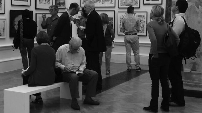
Visitors to the Summer Exhibition photo The Flaneur
This year Michael Craig-Martin has taken charge (see his highlights of the show here). Many of the rooms have been handed over to other Academicians to hang, but he has had a noticeable influence on several of the main spaces. Instead of leaving the walls the now-usual white, the central ones have been painted Craig-Martin colours – including bubblegum pink and magenta. This is a shock, but a successful decision and highlights the sterility of the rooms that have been left white-washed. The exhibition can claim considerable success if it provides the impetus for galleries in general to rethink their default walls-must-be-white setting.
The summer show is always an example of how exhibitions suffer without a consistent theme. With almost 1200 works in different styles from world-wide artists any consistency is near-impossible. As usual the show feels like a large-scale degree show, with favourites given large wall space in the central galleries and others stacked high in the smaller rooms.

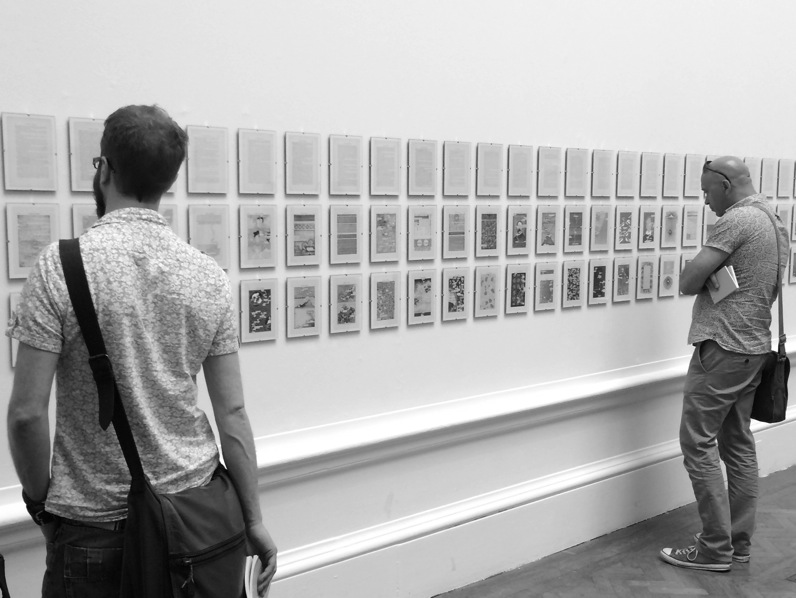
Detail of Humument by Tom Phillips
Tom Phillips has been given an entire room to display his large work Humument, which is the most interesting work in the show. Since 1966 Phillips has been reworking the pages from an old Victorian novel (A Human Document by WH Matlock). The exhibition shows the original pages along with Phillips alterations, which incorporate painting, collage, cutouts and drawing and show a vibrant enthusiasm and a sense of humour – ‘the critics make me ill ducky’ are some of the words that have been left from the original in the altered version. The pages are shown in the snap-fit frames that the art-world normally eschews, though some single prints are available in ‘proper’ frames for collectors. The work is better purchased in book form, which is (of course) possible in the gift-shop.
The hang is compromised by a lot of signs placed too close to works of art, saying Fragile, Do not sit here, Please do not put your glasses here. Sometimes they appear to be part of the work, although sadly I think they are just heavy-handed warnings. Ron Arad’s £114,000 chair sculpture includes a prominent Please do not sit here, which overpowers the piece itself. Either let people sit on it, or display it in a way that it can’t be sat on.
Other pieces that stood out included delicate hand-made barbed wire by Margaret Proudfoot (No.943), looking like a violent, knitted aerial map and Athena Tacha’s unnerving Riverbed Turns (No. 323). It is good to see some agit-prop on the wall, with Bob and Roberta Smith’s Sir Peter Bazalgette’s P45 (No. 934) trying to make a difference.
With so much on show you should see something you find interesting. You can preview the entire show online, or visit the exhibition in London until 16th August. You can also follow online tours of favourite works by people such as Grayson Perry, Cath Kidston and Harry Hill.

Leave a Reply