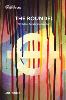
The London Underground symbol is without doubt one of the world’s great logos. It is now much-loved and imitated, but has adorned the London Tube system since 1908. Originally, as designed by Charles Sharland the red circle was a fully enclosed red disc. Redesigned by Edward Johnson in the early 1920s the bullseye lost its red centre and gained the two white spaces which add so much to the design.

The Roundel is a collection of contemporary recreations of the London Underground roundel. In 2008 Art on the Underground commissioned 100 contemporary artists to celebrate the centenary of the famous design by creating their interpretation of the logo. The artists chosen were at different stages of their artistic careers, from the newly graduated to those with towering art-world reputations. The reinterpretations range from the playful and irreverent like Tosten Lauschmann’s photograph of his son wearing a red hood with a horizontal blue sweatband around his nose to the conceptual work of Jeremy Deller who shows a photograph of an ex-Underground employee who was born in the same year as the roundel. He has tried to completely remove the logo from the image, but having been looking at a book full of London Underground logos it is hard not to see the roundel in the delicate eyes of the old man.
As well as the 100 images from contemporary artists, including Peter Blake, Gavin Turk and Liam Gillick, The Roundel includes three interesting essays. Jonathan Glancey provides a history, showing the design’s link to Trajan’s column and ancient Rome, along with examples of the way the design has been taken and developed by other cities for their metro systems. Claire Dobbin looks at the way the roundel has been creatively used in posters over the years, showing a Man Ray poster where the logo becomes a planet. Indeed it could be said that this entire project has grown out of the success of this 1938 Man Ray image. Finally Sally Shaw writes on the 100 recreations, picking out some of the images that force her to look at the roundel with new perspective. Her favourites include Paola Pavi’s Time to circle, a collection of small hand-drawn circles that together create a shimmering large version of the logo. This piece reminds her of Eduard Paolozzi’s mosaic at Tottenham Court Road. This is a reminder that art has always played a part on the Tube and I am grateful that that the Underground has not been over-protective. It has allowed contemporary art to experiment with its great design and given us this intriguing and diverse project.
With a full biography of the contributing artists and an introduction by Tamsin Dillon, head of Art on the Underground, this is an interesting art book that will appeal to commuters and those who love London as well as fine art and design aficionados.
Published by www.artbookspublishing.co.uk
RRP £12.95

Leave a Reply