He also famously recreates photographic blurring in his paintings with gentle, wispy strokes across the surface of the picture. The blurring becomes more prevalent throughout the exhibition as the signature painting technique. It evolves into large scale abstract paintings which have been pushed and pulled by a large squeegee to create obliterated surfaces bleeding in and out of each other. In places these seemingly different visual concerns are dynamic and energetic but they are also disconnected and block the viewer’s visual flow. This exhibition seems to want to unify Richter’s output into a cohesive train of thought but I felt that it was visually divergent and created two separate halves to the show.
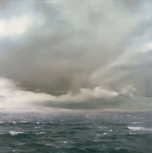
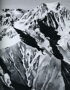
An example of where Richter’s different techniques work well together is in the corner of room 3. Entitled Damaged Landscapes, room 3 contains a series of landscapes which use a wide range of applications to depict lonely and desolate environments. The smooth, flatness of Seascape (cloudy) 1969 jostles for position in the corner with the rough, jagged Himalaya 1968. Standing between these two paintings produced a buzzing visual sensation. Looking back and forth at their obvious differences stimulated a pleasure of compatible contrast. Unlike the dislocation between the gigantic abstract and the intimate photorealistic elsewhere in the show, these two hung perfectly as antidotes to each other. They seemed to answer each other. Hard with soft, forcefulness with gentleness and grandeur with intimacy. They share values of monumentality but differ enough to keep it surprising. The short, flat white brush marks of the Himalayan snow against the silhouetted peaks and ridges of a hard edged, dominating mountain contrast sharply with the soft and warm underbelly of an encroaching storm cloud in Seascape (cloudy). The eye enjoyed searching through the expanse of flat subtle tonal and temperature shifting in the Seascape cloud and trying to find the line where these subtleties changed only to be constantly thwarted.
The antidote to this optical illusion came with the bold, brash and cutting forms of the Himalayan mountain. They both offered visual relief from one another but kept the visual stimulus perpetual. Seascape (cloudy) reminds me of the subtle tonal depth of Yves Tanguy’s Azure Day. Unlike Tanguy’s gradual recession into space, Richter’s precise move between warm yellow, orange with cold blue and grey challenges the eye to see the interplay of light through a cloud on a flat surface. The short, flat globulous brush strokes of Himalaya reminds me of George Braque’s cubist paintings. Short, sharp deliberate brush strokes building up geometric faces and edgy surfaces.
This variety is testament to his consistent concern with the image. “I don’t believe in the reality of painting, so I use different styles like clothes: it’s a way to disguise myself.”* Towards the end of the exhibition the photorealistic pictures become less startling and image choice becomes more random and less connected leaving each room fragmented. In the end I don’t trust him and that is testament to his technical ability.


I find Feather’s review more a pretentious exercise than as serious review, which is full of contradictions and is lacking in insight.
For example:
Quote –
‘This exhibition seems to want to unify Richter’s output into a cohesive train of thought but I felt that it was visually divergent and created two separate halves to the show.
It evolves into large scale abstract paintings which have been pushed and pulled by a large squeegee to create obliterated surfaces bleeding in and out of each other. In places these seemingly different visual concerns are dynamic and energetic but they are also disconnected and block the viewer’s visual flow. ‘
I have rotated these two statements extracted from Feather’s review, which demonstrate the contradictory tone of writing. He begins by referring to an ‘evolving’ then ‘visually divergent and … two separate halves…’ ? It is either ‘evolving’ i.e. sequential or not.
Feather also fails to refer and comment on the ‘glass’ pieces?
Gerhard Richter ‘Panorama’ provides, as publicised a ‘retrospective’ of the artists lifetime work and whilst there are some apparently non-sequenced placings of work on the whole it does provide an acceptable and informative insight into the development of his practice.
The painterly blurring of the image, which is used as a representation of the photograph (a memory), which was not substantially out of focus, is a clever device that Richter uses to entice the viewer to share the memorial experience of an event. The ‘October’ series is possibly the most obvious example of this experience and if there is a weakness, in this instance, it is like so often based on out own recollections; if you are not aware of Meinhoff then the imagery lacks impact.
The show ends soon – very much worth seeing – go and make our own mind up!
Thanks Felix but I was trying to describe how the abstraction of the image seems to be the evolution/ devolution of Richter’s work which we know may not be the case because he works at abstraction and ultra real paintings at the same time. I think the exhibition tries to describe a sequential story (and does chronologically) in the production of Richter’s work but can’t pull this off because of his sustained practise in both styles. The stye clashes do not allow for a visually linear reading of his work and it becomes duller as the exhibition goes on. I don’t think there is anything contradictory about that!!
The glass pieces did not interest me and I was not trying to do a review of the whole show but focus on the two paintings which excited me.
But it is worth seeing so please go
Thanks
I enjoyed this review. You gave a nice coverage of the show.
Thank You